BY ASH KILMARTIN
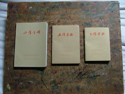
A friend, recently returned from visiting family in China, presented me with a set of three notebooks. The largest, about the same length as my hand from fingertips to heel of palm. The smallest, making it just to my first knuckle from the heel.
The covers are of thin recycled paper, the colour of each a slightly varied shade of golden-tan, a colour I can't help but associate with thrift and pleasing uncontrivedness.
The unassuming nature of the books is further stated by the cover inscription: in red, four characters translated as "note book". Below this assertion, in a position on the page that tells pleasantly of well-considered design, lie two parallel lines. Also in red, they echo in the lower third of the page the form of the characters in the top third, encouraging the owner to make their own inscription – a name; perhaps their own or that of a project to which the book is dedicated.
The cheap material and simple form do not entail shoddy workmanship: the pages of each differently-sized book are bound in six sets of leaves, creating six evenly-sized humps at the spine when viewed from above and six small ridges which run the length of the spine, interrupted by the four adjacent rows of stitching which hold the sets of leaves together.
The text-block (the bound-together paper stock) is attached to the cover by glue at the spine, and secured by white end-papers (the pages attached to the inside covers and the first adjoining pages). Such perfectly-glued end-papers are probably my favourite feature of these notebooks.
The pages themselves are of thin recycled stock – like the covers, the pages differ slightly in colour between sizes. Each is finely-ruled (7mm, by my eye) in indigo ink, with two close lines separating the heavy header-space from the lined body of the page. No margins. All perfectly printed and matched, but for one page in the largest notebook, which is charmingly askew. Here, the lines march off the page at a thirty-degree angle, as though heading dynamically into avant-garde Soviet poster design. Quietly combatting loathed dog-earring are gently rounded corners at the upper and lower left-hand corners.
On the back cover, corresponding in place and scale to the parallel lines on the front, are four lines of characters and numbers. What they describe, I can only guess (or, I guess, ask said friend to translate). Their exact origin is unknown to me, although I'm told they're Government-issue books once given free to employees of the state-owned corporations. That they're apparently becoming harder and harder to find only adds to their mystery and appeal, of course.
***
Sunday, January 20, 2008
Note Books
Subscribe to:
Post Comments (Atom)
1 comment:
Very exquisite description~
Actually the first two characters says "work", while the other two says "booklet".
The back cover states the product number, product name, product specification and the company that produced it.
Post a Comment